Introduction
This was a short one-week project in order to showcase our MedicApp mobile app
(see the MedicApp project here).Because of this, I chose to design a simple one-page website. While the rest of the team worked on the presentation slides, I was in charge of creating the website.
As this project was so short, there would not be time for external user testing, so I leaned towards a simple website with minimal interactions.
Solution
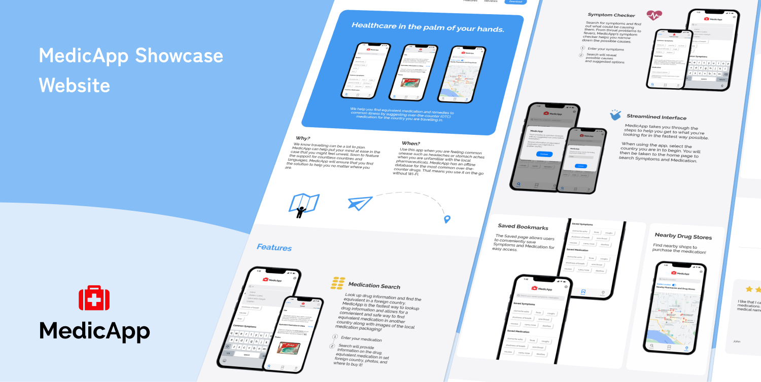
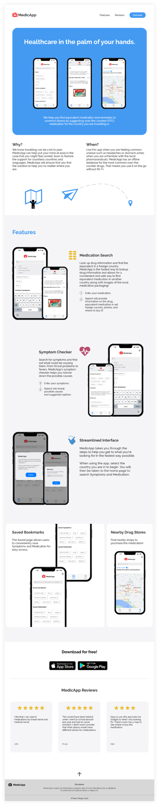
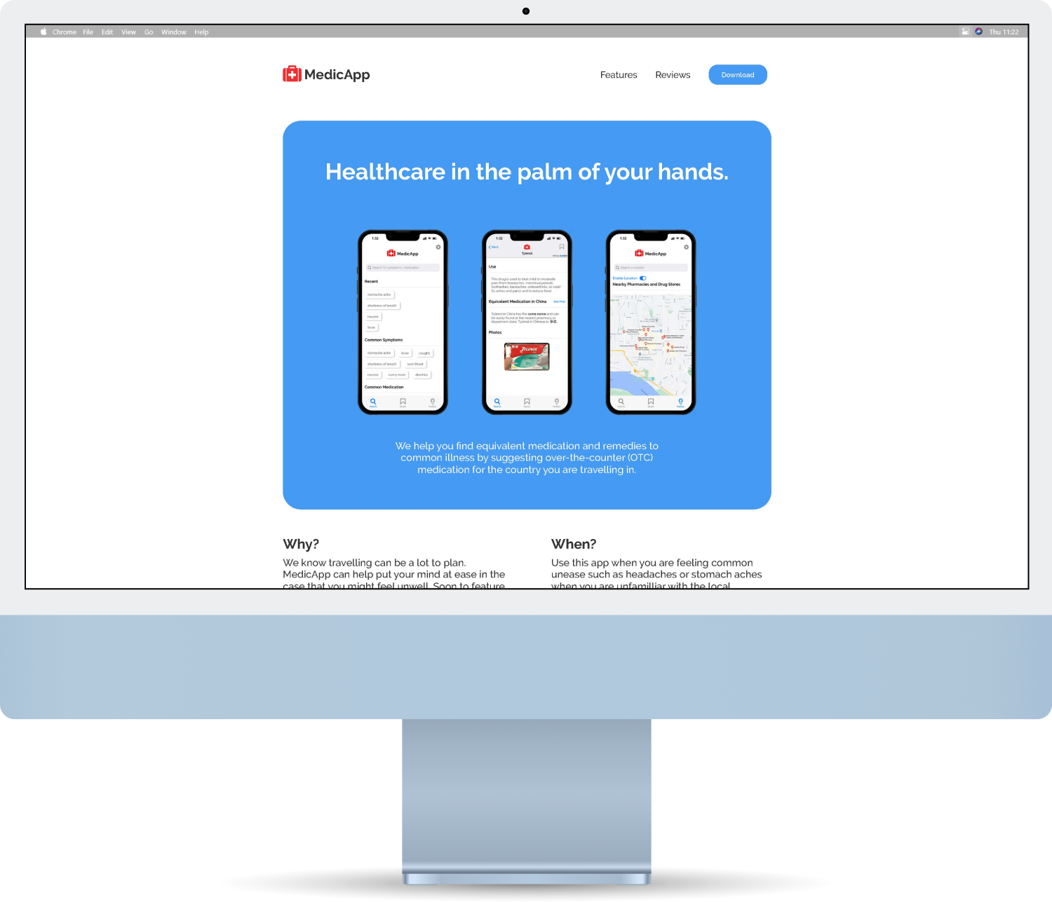
A simple website, showcasing MedicApp's features and promoting its use on one concise page.
I initially divided content within a 2/3 grid system to maintain an organized and clean look. This grid system was maintained for the last iteration. I used a consistent 200ms animation for revealing content as the user scrolled and 800ms to move the content slightly up.
Limitations
At the time, I did not know HTML & CSS and so I built the website using prototyping software Axure RP and only made the prototype for a desktop screen size.
Styling
While I initially started mainly using pink and red, some early feedback I got was that this was not a good colour to use for medical-related apps. And so I switched it to a more subdued blue colour which is also used as a secondary colour in MedicApp. Shades of gray and white was also used following MedicApp's use of them.
Raleway was used for its clean look and to match the app's font. It is also web-safe and will look as intended for the user, regardless of the device.
Wireframes and Prototype
In the first layout, I focused on having what was essential, including an intro, a showcase of features, and more images.
In my second layout, I refined where images and text would be placed to show relevant information closer to the top. I later combined the intro and overview which allowed the main features to be moved up and more in view.
For the final design, I added more images in a way that was not cluttered by having the phone images next to each other while having plenty of space between the pairs of images.
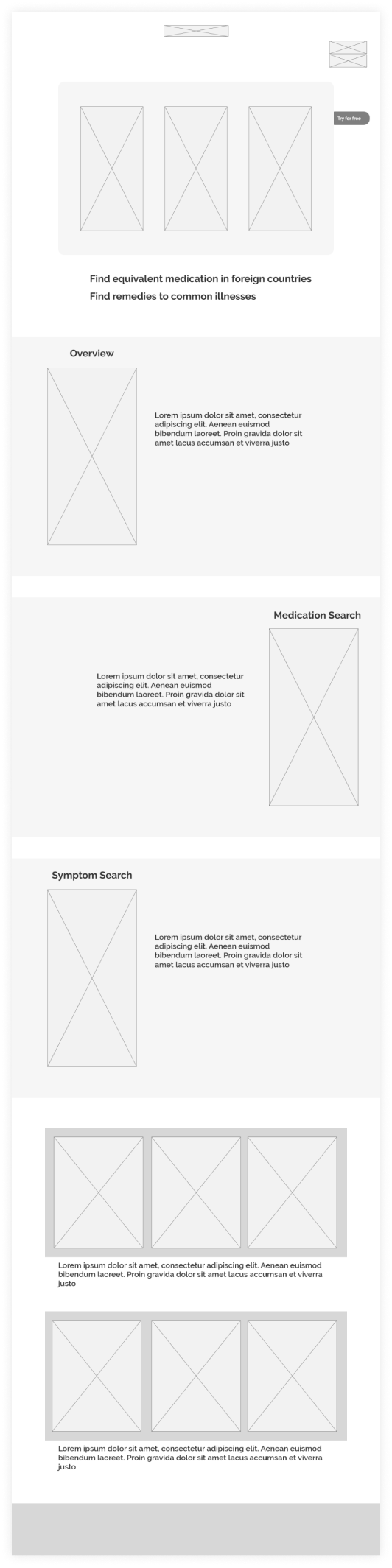
Wireframe iteration 1
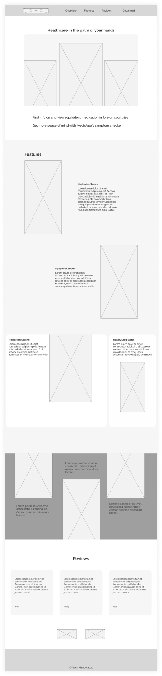
Wireframe Iteration 2
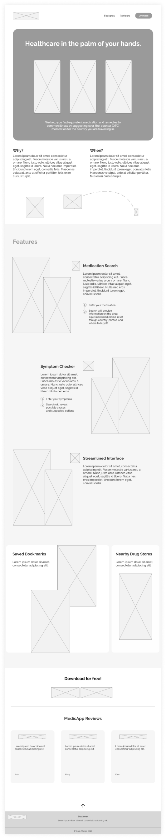
Wireframe Final Iteration
Final Prototype
Reflection
Feedback was limited due to the timeframe and I relied on what I had learned throughout the course in interface design.
While this was a short venture, I learned to better prototype websites in a short amount of time. External user testing was not done due to the short time frame, but I feel that the website plays its role well in showcasing our final app and we got positive feedback.
I also assumed that users would prefer a single page to scroll through rather than going through several pages. Assumptions, of course, should be based on user research and testing which should have been done had time allowed.