Travelling Medication Companion
MedicApp Mobile App (UI) - Fall 2020 Academic Project
Introduction
The team first chose a design domain of those aged 20-30 who want to travel in the next 1-2 years. I was in charge of gathering preliminary user data to better focus our app on young travellers and then designing our prototype. I sent out a survey asking people what the most important aspect of travelling was for them.
Opportunities
The survey revealed that people care a lot about safe travel and health, the location of stay, and the local culture. We decided to focus our app on safe travel and health, especially because some people found there to be a lack of medical support when travelling internationally.
The simulated database I proposed we use was WebMD for its vast medication and symptom data.
Early Sketches
I wanted users to be able to quickly search for medications and symptoms and thus the search is placed on the homepage. A Saved page allows users to save medications or symptoms for easy access offline, especially when travelling in areas without access to wifi. The Map page helps users find nearby stores that sell medication while travelling.
Solution
An app to guide users to equivalent medication and remedies for common illnesses while travelling internationally. Also lets users bookmark medication and illnesses, and locate nearby drug stores.
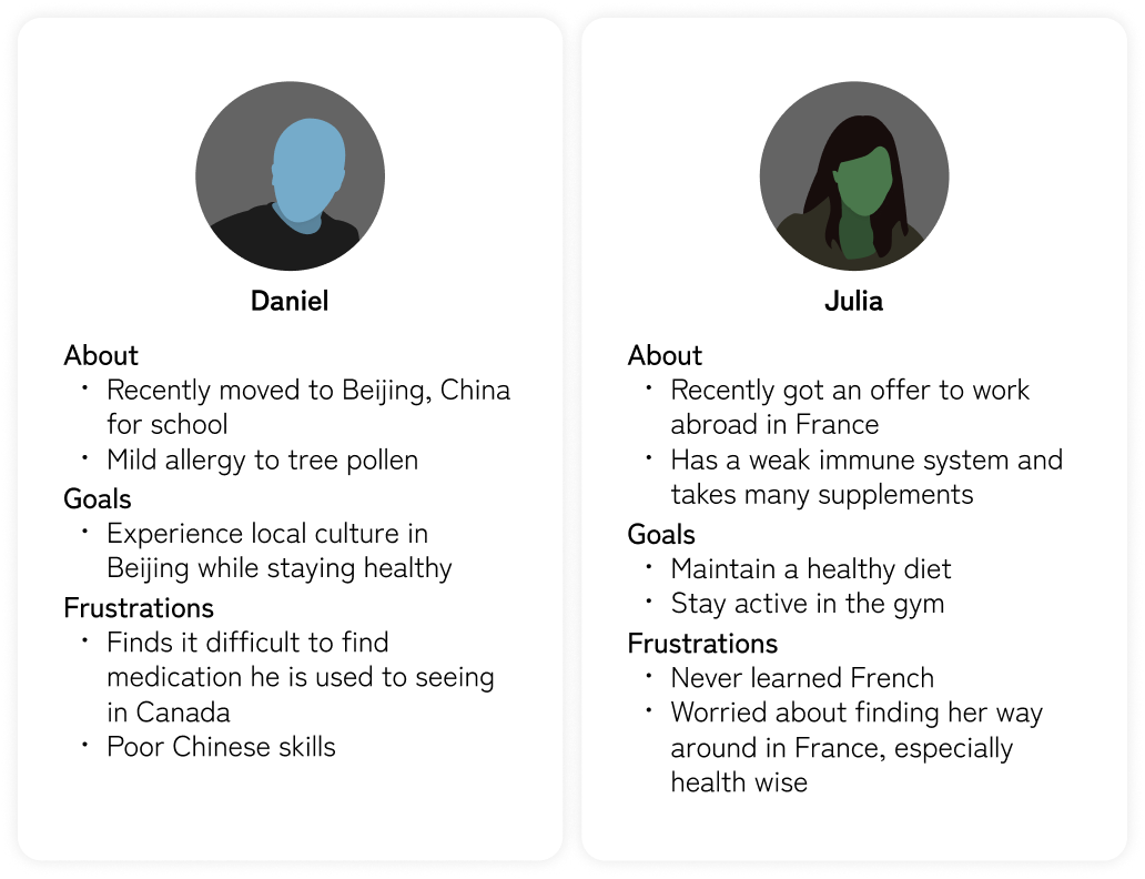
Target Users and Their Goals
- Health-conscious Canadian travellers aged 20-30
- Stay healthy and safe while travelling internationally
- Be prepared when they or someone they are travelling with becomes ill
- Get their illness under control quickly and effectively
Styling
I chose to use mainly shades of gray to maintain a simple look. Blue was used for navigation as it stands out and fits well with my white design.
Raleway was used as the primary font for its clean and simple look. As a secondary font, Roboto was used as it maintains a clean aesthetic. It was mainly used for headings as it is more condensed.

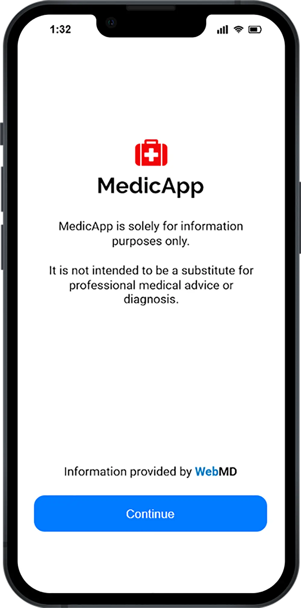
First-time users start screen.

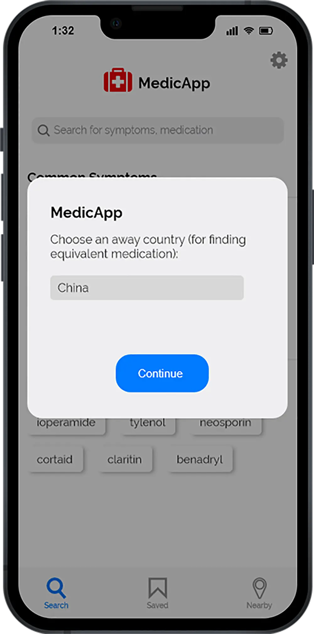
User selects an Away Country to show relevant equivalent medication.

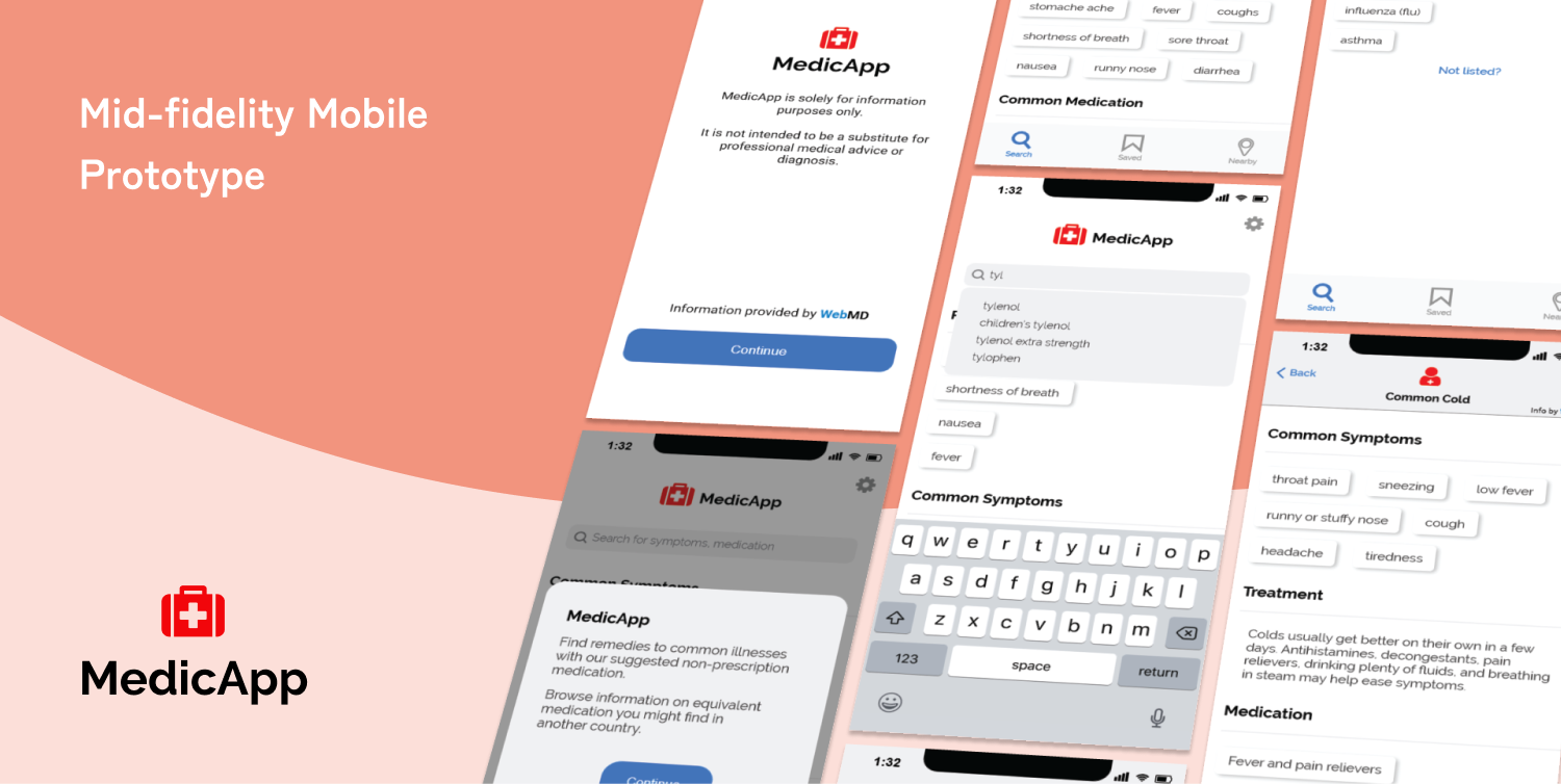
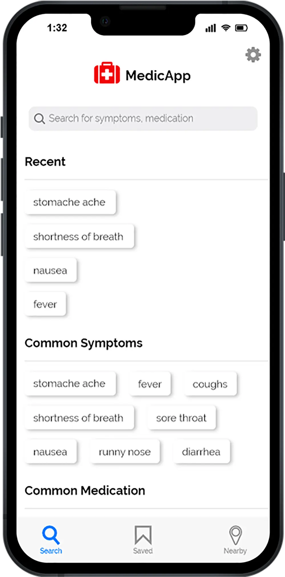
On the main Search Page, users can easily search for symptoms or medication. They can see recently searched and suggested common terms. A simple navigation bar at the bottom allows easy access to the main pages.

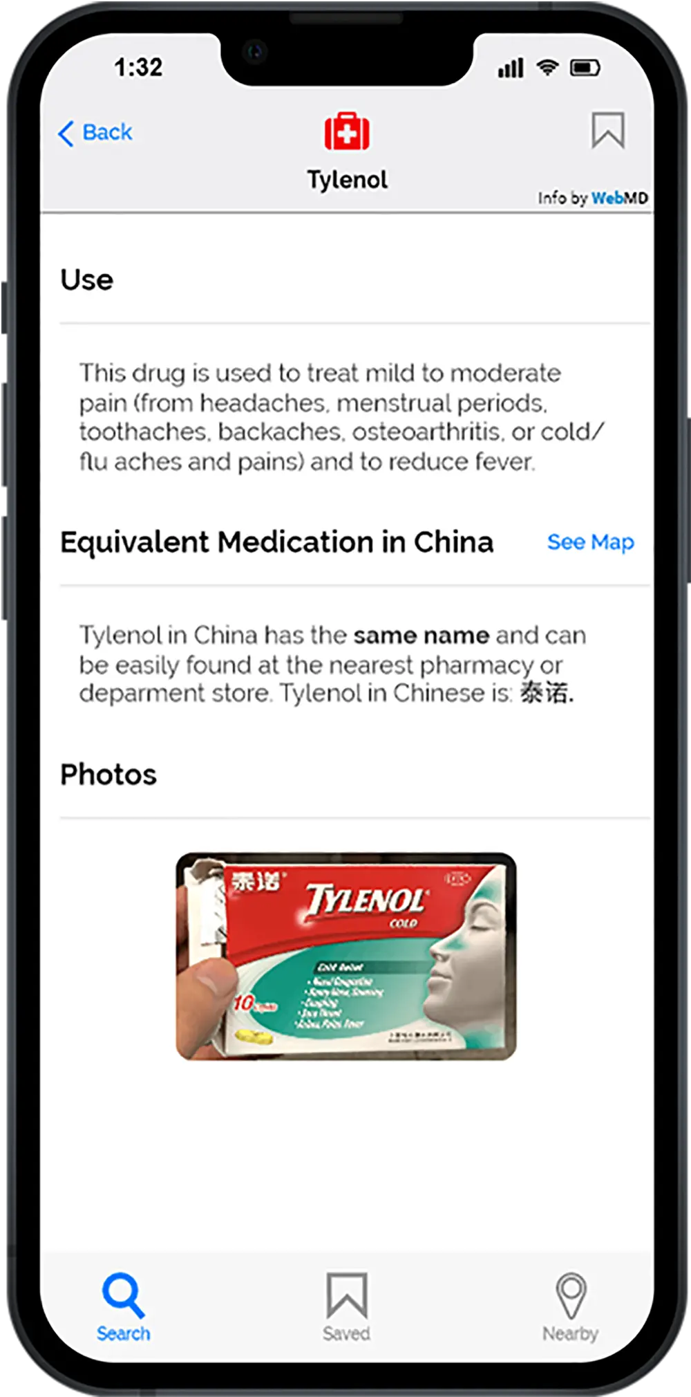
The Medication Page contains medication information and the equivalent one in the user’s set away country. Provided photos help users easily find the medication.

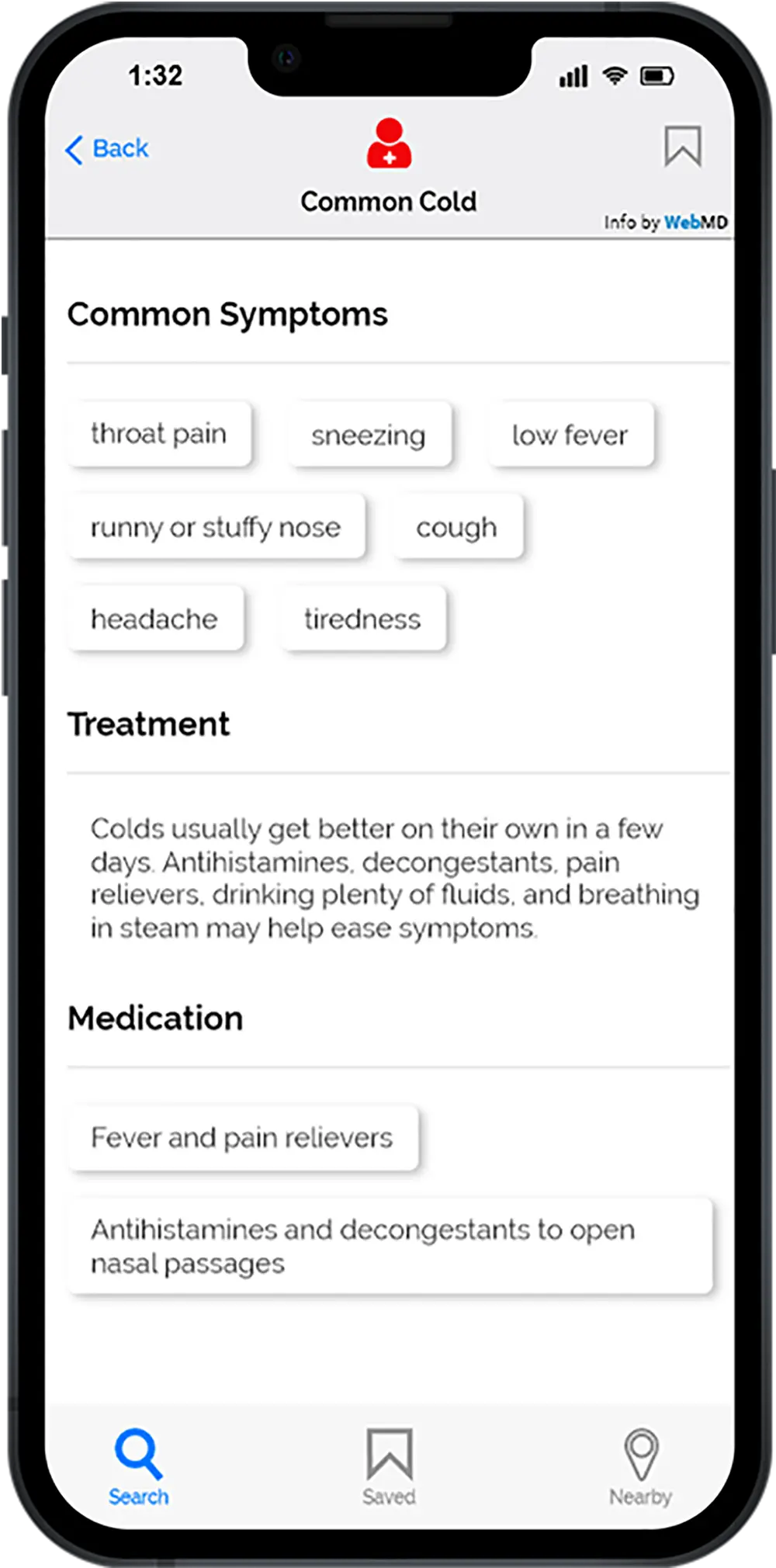
An Illness Page shows information about symptoms, treatment, and common medication. Symptoms and medication can be tapped on to see related illnesses or relevant medication. This allows a convenient connection to related information.

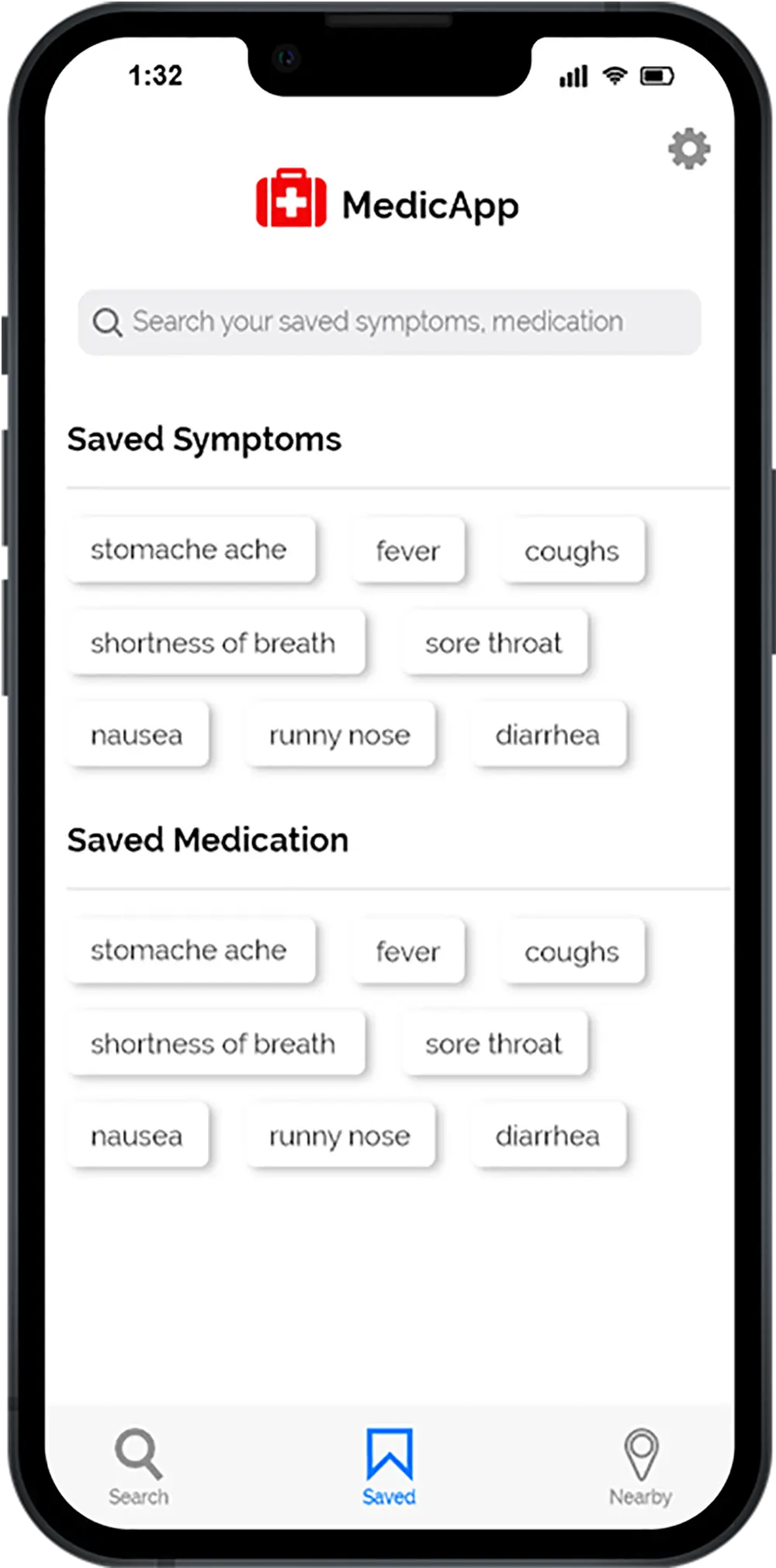
The Saved Page contains the user’s saved symptoms or medication. They can also search through them at the top. In retrospect, these arbitrarily placed boxes may have been better as a list to be more clear.
Reflection
As this was the first time prototyping a mobile app, I struggled with the placement and design of many elements. For instance, the 'Saved' page may not be intuitive with its small rectangles. Perhaps a list would have been better for organization and clarity.
In the early stages, we did not have alternative prototypes apart from this one. This drastically slowed our progress, as we did not have many ideas to take from. With only three weeks, user testing was minimal, mostly being tested internally by the team.
In terms of scope, I do feel that our app's scope was a bit too large, with not only equivalent medication but also symptoms and illnesses. Perhaps the app could have just focused on equivalent medication.
