Background

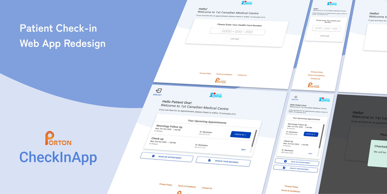
Porton Health’s CheckInApp is a web app for clinic patients to check in to their doctor’s appointments from any device. I was asked to evaluate Porton Health’s web apps, in this case, the CheckInApp, to find usability concerns and to adjust its design where necessary.
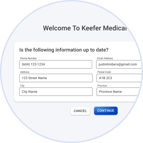
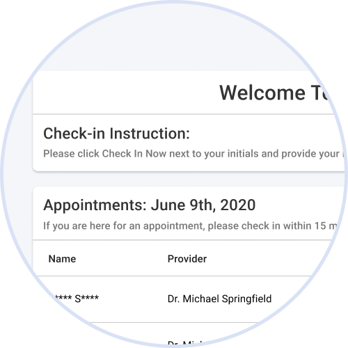
Current CheckInApp Interface.
Development
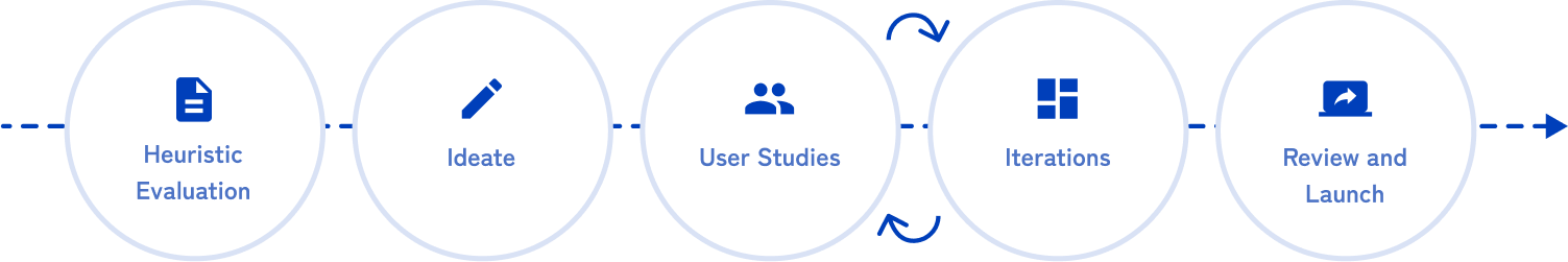
As the UX/UI designer, I was in charge of planning and conducting user research while updating the user experience and interface. My approach was to first conduct a heuristic evaluation and present initial issues to the team before planning and conducting user studies while continuing to improve the user experience. Lastly, reviewing with developers and assisting them in the launch.
Heuristic Evaluation

Conducting an individual heuristic evaluation first, I analyzed usability issues and presented preliminary issues to the team before diving into user studies.
This evaluation led to discovering issues mainly regarding the minimalism heuristic of only showing what is relevant to the user at the current time. Some issues to note were:
Heuristic: Aesthetics/Minimalism
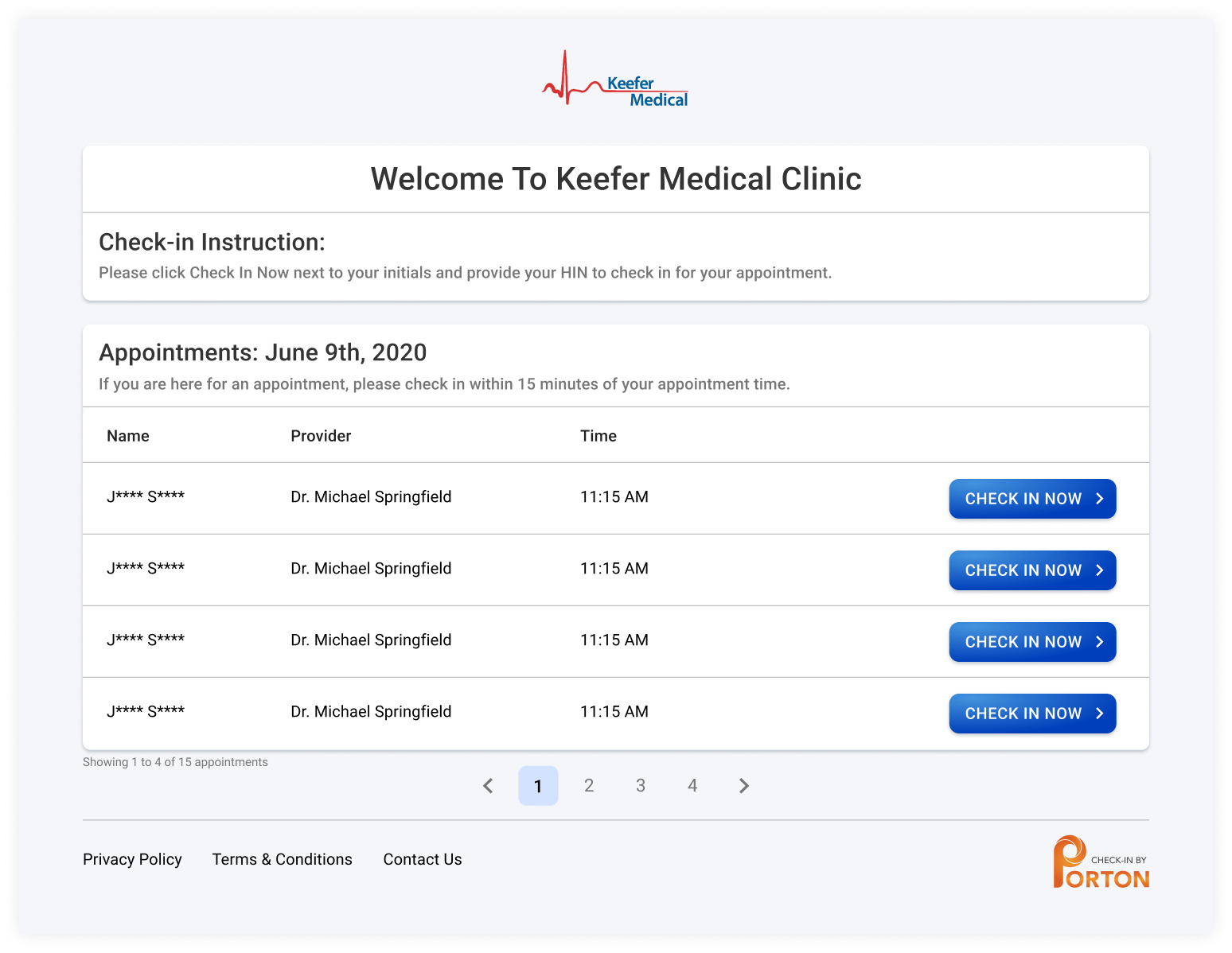
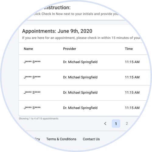
The patient queue shows every patient, showing irrelevant information for the current patient.
Heuristic: Aesthetics/Minimalism
The updating records screen shows up without user input.
Heuristic: Help/Documentation
The interface should be clear with minimal instructions. The Check-in instructions can be reduced.
Initial Wireframes
From my Heuristic Evaluation findings, I made a rough wireframe and prototype to present what the experience could look like as I presented the issues to the team. From here I planned and conducted User Studies to continue iterating.
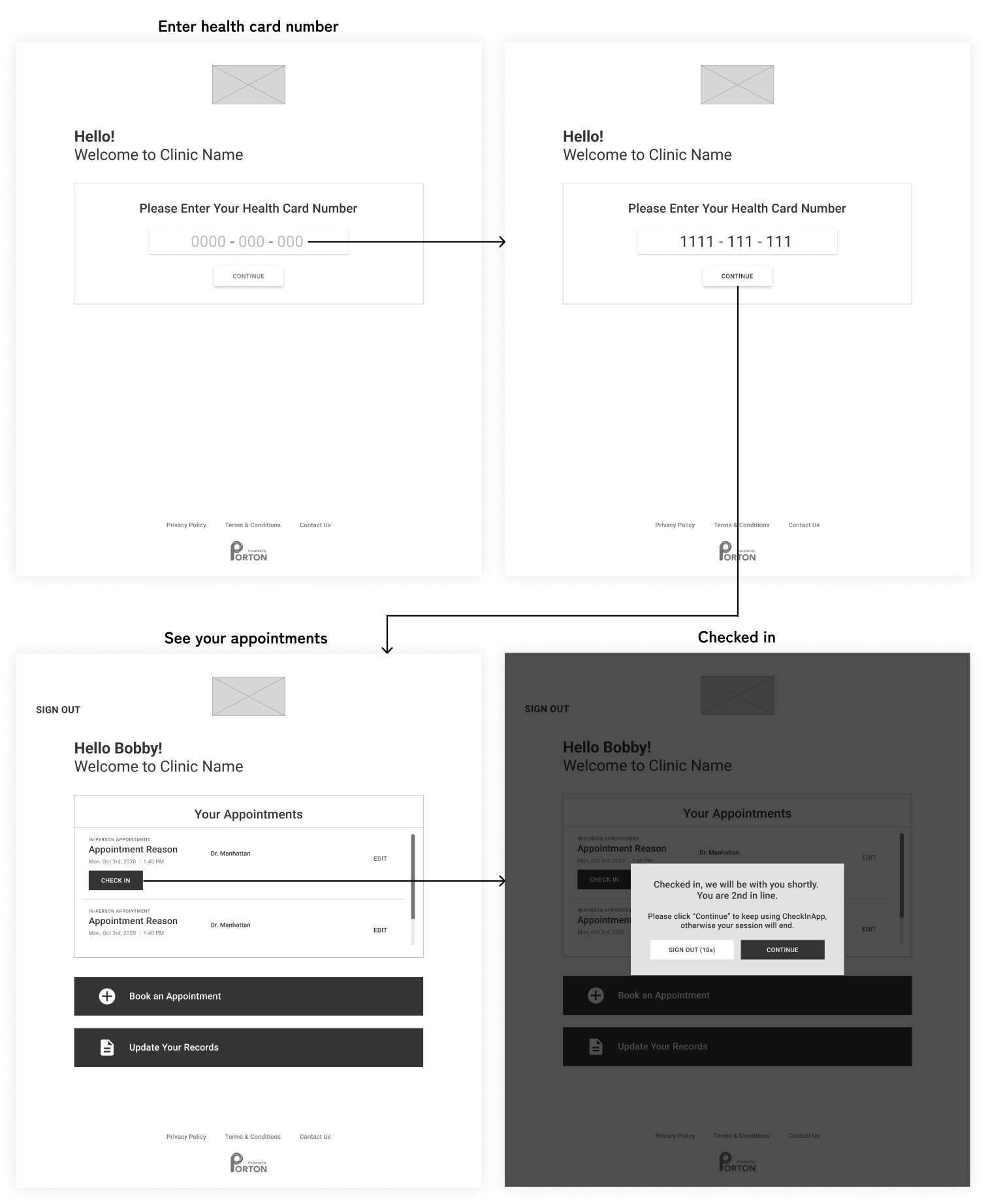
Initial Wireframe to block out main elements.
User Studies

Procedure
Participants were recruited from patients of our current client clinics and other external participants. Most of the user studies were done virtually and on their own time due to my limited access to clinic patients, so I decided it would be best to use Google Forms to guide participants more easily.
Several user studies were done throughout the design process, with 3-4 users each time.
Summary Insights from User Studies
In general, most users found the current CheckInApp generally clear but there were some frustrations or confusions to note.
- Users don’t want to see everyone’s appointments.
- The notification page is confusing with the several options for digital and in-person reminders.
- They don’t need to update their information.
- Users would like to see the day of the appointment (Mon, Tues, etc.).
Internal and Client Feedback
While internal feedback was secondary to my user studies, gathering feedback from the team, especially the developers, was important to ensure it was feasible to be built.
Additional feedback from Clinics was being able to book appointments from within the CheckInApp. Previously, we did talk about unifying our web apps, but it was not feasible at the time, so the ‘Book an Appointment’ button remained as a link to our BookApp.
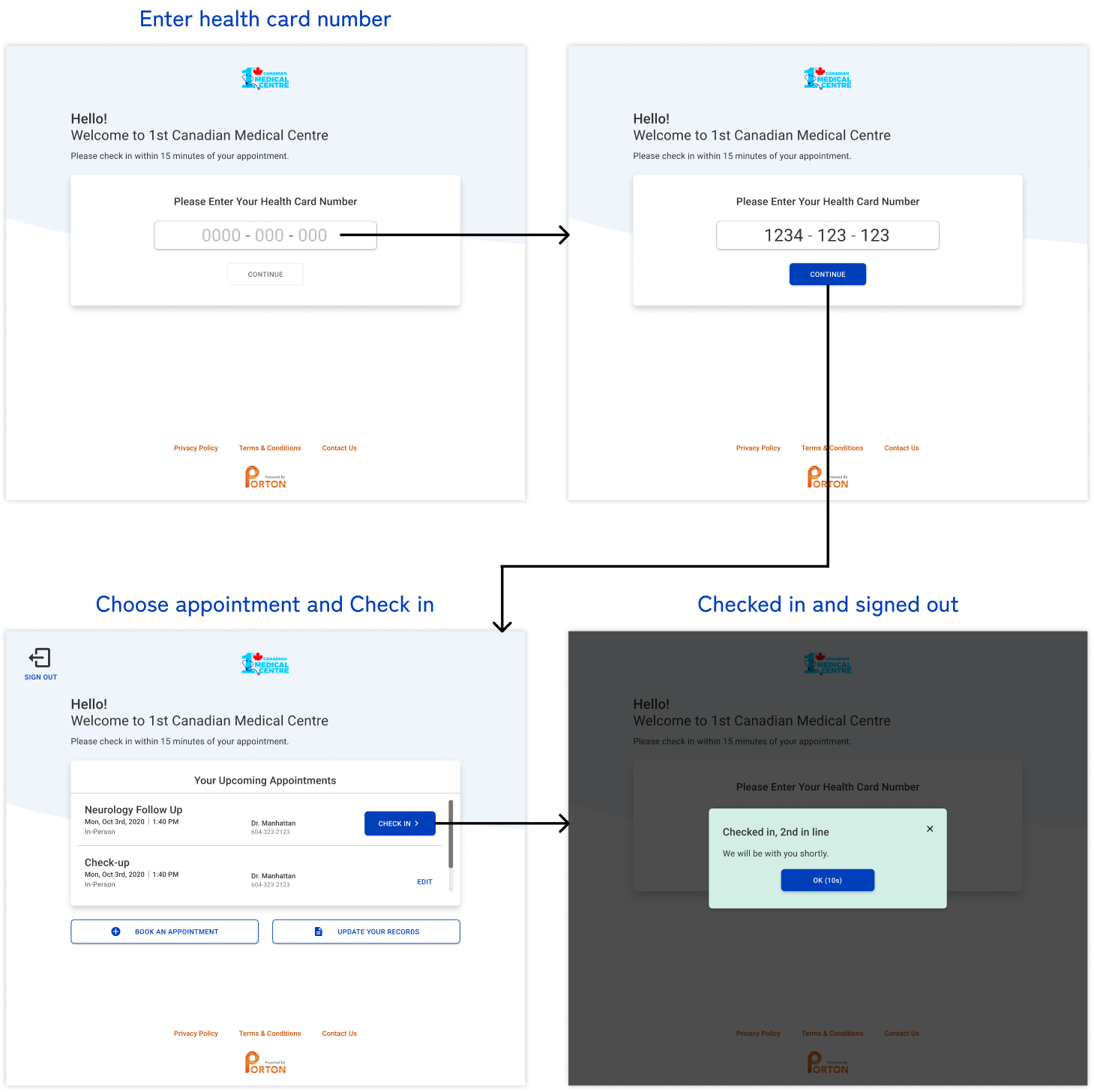
Solution

Primary User Flow
Full User Flow
Includes all possible touchpoints.
Responsive Designs
Includes sizes from desktop to mobile.
Reflection
As my first UX/UI Co-op, it was interesting to design in a start-up company where I was the sole designer. It was fulfilling to make impactful changes to the user experience that I could see being implemented by the team, to then be used by clinic patients.
The heuristic evaluation was limited as 4+ evaluators are ideal. As such, I likely missed some issues, which was where my user studies came into play.
With more time, I would want to add the notification settings that was initially removed into the ‘Update Your Records’ modal. After checking in, users prefered being notified in person when it's their turn to see the doctor and so we decided to remove this mandatory page to make the check-in process more efficient.
Feedback
Management was very happy with the changes, with patients now entering their health card number first, they felt that it was much more efficient for users with improved privacy. As my co-op term ended, the developers were still in the process of implementing the new user experience.