Evaluating Meal Delivery Experiences
Design Evaluation (UX) - Fall 2021 Partnered Academic Project
Overview and Role
Partnering with Planted Meals, they requested we evaluate a new design for their website and ordering process.
My role was to conduct a heuristic evaluation and design, then conduct the observational study.
Goal
Conduct a design evaluation with a partner company. Work with them to complete an evaluation that fits their needs.
Solution
A heuristic evaluation and an observational study to test the website's usability.
Role
Heuristic Evaluator
User Study Researcher
Team
Raymond Co
Sebastian W.
Adrian F.
Ethan M.
Tools
Figma
Timeframe
5 Weeks (2021)
Platform
Mobile
Introduction
Usability study to for Planted Meals' updated meal purchasing experience
When we first contacted Planted Meals, a meal delivery service, they had been working on redesigning their website. They wanted insights on the new design regarding usability concerns and what kind of personality it gave off.
We decided that a heuristic evaluation and an observational study would be most comprehensive in the short allotted time frame of 5 weeks. While a controlled study was considered, early studies revealed that we would be able to garner more data with a less controlled, observational study.
My role was to complete an individual heuristic evaluation and lead, then conduct the observational study.
Research Questions
Research questions used to guide our study.
- 1. How do users feel about the personality of each site?
- 2. Are there usability issues in the ordering process and other pages of the website?
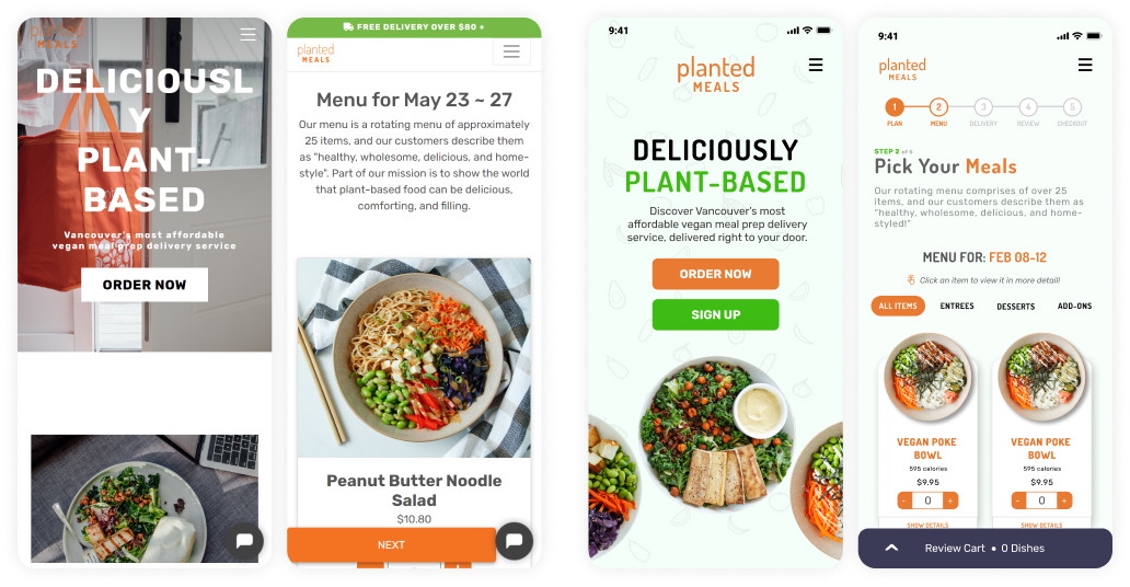
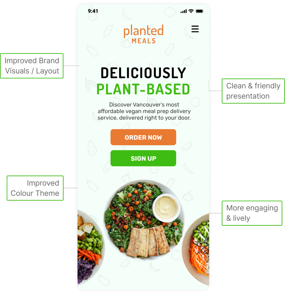
Current Site on left, redesigns on right (designs by Planted Meals).
Heuristic Evaluation
The heuristic evaluation was used to gauge the usability of the new ordering process using Jakob Nielsen's 10 Usability Heuristics.
Procedure
We individually performed a heuristic evaluation based on a task for an intended user, a vegan who worked from home and was often too busy to make their own meals.
The task was to: Make a ‘One Time Purchase’ of two Kale Caesar Salads, and one chocolate chip cookie to your cart. On the order confirmation page, add a Chickpea Smash Jar.
Observational Study
I led the design of the observational study which compared the current and new mobile websites and was designed to analyze personality and usability, addressing Planted Meals' initial requests
Procedure
Most studies were conducted remotely, as such, Google Forms was used to guide participants through tasks. A pre-study questionnaire helped us understand participants' demographics and familiarity with food ordering platforms.
They completed four tasks and were asked to think aloud their thoughts so we could better understand their actions and when necessary, to elaborate on their thoughts:
- Explore the old Planted Meals mobile website apart from the ordering process.
- Explore the new Planted Meals mobile website apart from the ordering process.
- Using the old Planted Meals mobile website, make a ‘One Time Purchase’ of two Kale Caesar Salads, one chocolate chip cookie to your cart. On the order confirmation page, add a Chickpea Smash Jar.
- Using the new Planted Meals mobile website, Make a ‘One Time Purchase’ of two Kale Caesar Salads, one chocolate chip cookie to your cart. On the order confirmation page, add a Chickpea Smash Jar.
The mobile device was screen and audio recorded for the purpose of further analysis. The post-study questionnaire asked participants questions regarding the sites’ personality and usability.
Limitations
As the new designs were currently only responsive for mobile, the study was conducted for that size.
Heuristic Evaluation Limitations
- While four to five evaluators are ideal to find the majority of issues, the team was comprised of senior design students. As such, we lacked the professional experience that would have enabled us to find more problems with better analysis.
Observational Study Limitations
- Use of Figma designs which were a work-in-progress
- Bias, as participants could see which was the current or new site, with the new one on Figma
- No vegan participants, though Planted Meals noted that they looking to expand their customer base beyond vegans.
Results
New website had an improved brand identity but the experience had unclear or missing infomation.
Heuristic Evaluation
From my individual heuristic evaluation, the notable issues I found were:

Heuristic: Minimize Memory Load
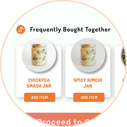
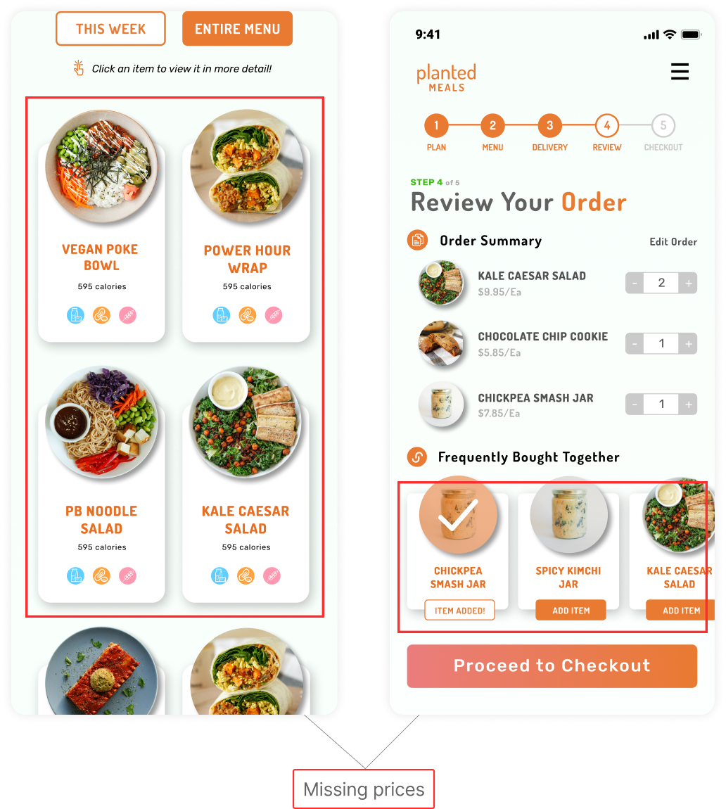
No prices shown within the "Frequently Bought Together" section

Heuristic: Consistency
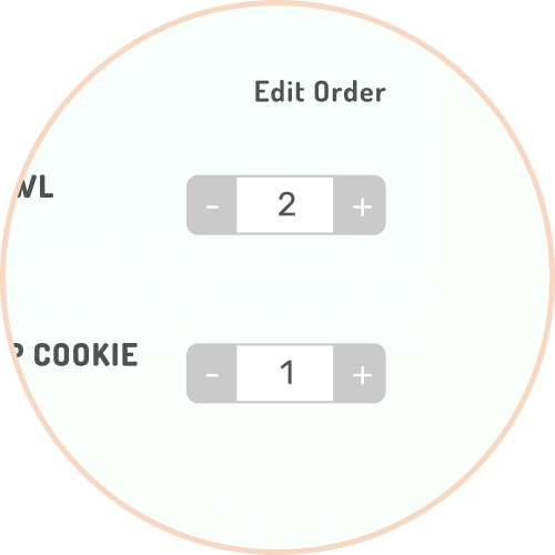
Gray colours are used when the buttons are meant to be clickable

Heuristic: Provide Clear Exits, Provide Shortcuts
In the order process, users cannot easily jump to different steps
Affinity Diagraming
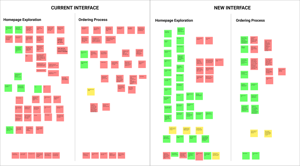
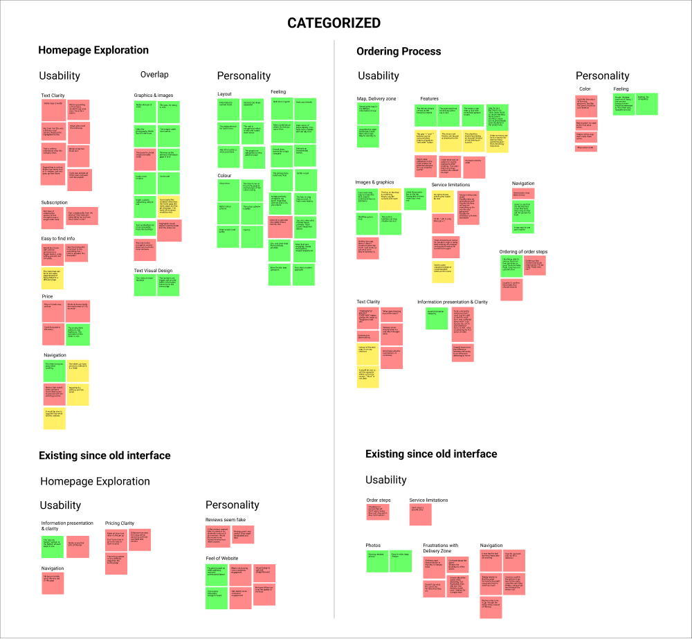
Triangulating data from the Heuristic Evaluation and Observational Study, we used Affinity Diagramming to group data through several layers of categorizing before summarizing and analyzing the results.
First Affinity Diagram: Uncategorized Issues (new design on the right).
Fourth Affinity Diagram: Unified issues to those still outstanding.
Revisiting Research Questions
1. How do users feel about the personality of each site?
The majority of participants liked the new website, citing a clear brand identity, with improved colours and layout.
- "Clean colourful and earthy"
- "Bright, colourful, welcoming, easy to use"
2. Are there usability issues in the ordering process and other pages of the website?
While users generally found the redesigned website easy to navigate, there were a few areas of concern.
Unclear Design
- Most prominently, users were confused with unclear copywriting within the About Us, Pricing, and Blog pages. They were also unsure about the wording in the delivery step at checkout.
- "Can't order off the main page is kind of strange?"
Missing Information
- On both the website and ordering process, users wondered about pricing in places that lacked any pricing information.
- "I mean do I want to know the price if I'm looking at these menu images, that would be something I want to know"

Reflection
Number of participants was limited but Planted Meals was taking our recommendations into account.
An early challenge we faced was that we did not have access to recruit existing Planted Meals' vegan customers and used external participants.
While 5 weeks was fine for the scope of the project, with more time I would have recruited a larger number of participants. They could then be grouped into separate groups such as experts and non-experts, which would have yielded more extensive results in the usability testing.
Feedback
At the end of the term, we presented our study to Planted Meals and received positive feedback. We sent them our report detailing all issues encountered and they noted that they would take our recommendations into account as they continued working on their redesign.
